- Get link
- X
- Other Apps
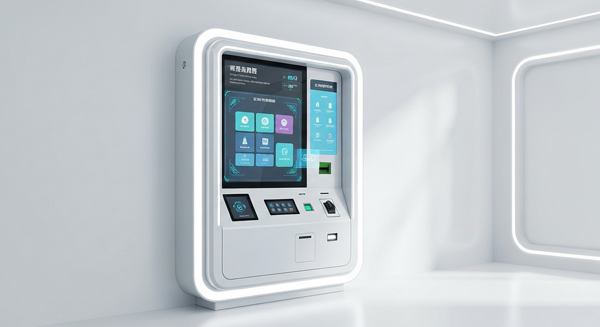
In today’s fast-paced digital world, self-service kiosks have become a staple across industries — airports, retail stores, hospitals, banks, restaurants, and even government service centers. Whether they are used for checking in, paying bills, purchasing tickets, or ordering food, kiosks promise convenience and efficiency. However, the real success of any kiosk depends not only on its hardware and software but also on the user experience (UX) it delivers.
A kiosk with poor UX can frustrate users, cause errors, increase wait times, and ultimately discourage adoption. On the other hand, an intuitive and well-designed UX makes the kiosk easy, fast, and enjoyable to use — leading to higher customer satisfaction, operational efficiency, and business success.
Unlike mobile apps or websites, kiosks are often used in public environments where people may feel rushed, distracted, or under pressure. This creates unique UX challenges: how to help users complete tasks quickly, avoid confusion, and feel confident in their interactions. In this blog, we will explore key principles of kiosk UX design, accessibility considerations, and methods for testing and refining the user journey.
Key Principles for Designing an Intuitive Kiosk Interface
The foundation of great kiosk UX lies in making the interface intuitive, efficient, and accessible. Users should be able to walk up to a kiosk and immediately understand how to use it — even without prior instructions. Let’s look at the core principles that guide intuitive kiosk design.
Simplicity and Clarity
Clutter is the enemy of usability. Kiosk interfaces should prioritize simplicity, displaying only the essential information required for the task. Clear labels, concise instructions, and well-organized layouts help users make decisions quickly.
For example, a ticketing kiosk should avoid displaying promotional messages or irrelevant options during the transaction process. Instead, it should highlight only the required steps: selecting destination, choosing seats, and completing payment.
Accessibility Through Design
Accessibility should not be an afterthought. From text size to screen height, every element must be designed so that it can be used by as many people as possible. This includes considering individuals with visual, motor, or cognitive impairments.
Consistency
Consistency in colors, icons, and button placement reduces the learning curve. If the “confirm” button is always green and located at the bottom right, users will know where to find it across all steps.
Quick Task Completion
Most kiosk interactions are short and goal-driven. Whether users are checking in or making a payment, the process should be optimized for speed. Long forms, unnecessary confirmations, or hidden menus can lead to frustration.
Optimizing Touchscreen Usability
Touchscreens are at the heart of kiosk interfaces, and poor touchscreen usability can ruin the entire experience.
- Finger-Friendly Design: Unlike a mouse or stylus, fingers are less precise. Touch targets should be at least 9mm x 9mm with enough spacing to prevent accidental taps.
- Responsive Technology: The screen must be responsive to touch inputs, minimizing delays or missed taps. Capacitive screens, for example, generally provide better sensitivity and accuracy than resistive ones.
- Avoid Overuse of Gestures: While swipes and pinches are common on smartphones, not all kiosk users may be familiar with them. Stick to simple tap-based navigation unless advanced gestures are absolutely necessary.
- Error Prevention: Provide confirmation prompts for high-stakes actions like payments, while avoiding unnecessary steps for simple actions.
Creating Clear Visual Hierarchies
An effective kiosk interface uses visual hierarchy to guide users naturally. Here’s how:
- Color Coding: Use colors to differentiate between actions (e.g., green for proceed, red for cancel).
- Size and Placement: Larger buttons for primary actions should be placed in easily accessible locations, typically the bottom center or right side.
- Contrast and Readability: Text should be readable under various lighting conditions. High contrast between background and text ensures clarity.
- Progress Indicators: Displaying a progress bar or step indicator reduces user anxiety and clarifies how many steps remain in the process.
Ensuring Accessibility and Inclusivity in Kiosk Design
Kiosks must serve all users, including those with disabilities or limitations. Accessibility is both a legal requirement in many countries and a moral responsibility for businesses.

Designing for Diverse Abilities
Visual Accessibility:
- Offer text-to-speech functionality for users with visual impairments.
- Provide adjustable font sizes and high-contrast modes.
Motor Accessibility:
- Ensure physical buttons (if present) are easy to press.
- Position touchscreen interfaces at wheelchair-accessible heights.
Cognitive Accessibility:
- Use plain language and avoid technical jargon.
- Include visual aids such as icons and illustrations to support comprehension.
Standards like the Americans with Disabilities Act (ADA) and Web Content Accessibility Guidelines (WCAG) provide frameworks for ensuring kiosks are inclusive.
Supporting Multilingual and Multicultural Users
Public kiosks often serve a diverse user base. Language and culture play a big role in usability.
- Multiple Language Options: Provide users with the ability to select their preferred language at the start.
- Culturally Relevant Icons: Icons or symbols may carry different meanings across cultures. Use universally recognized visuals whenever possible.
- Localization of Workflows: Adapt layouts or processes to align with cultural norms. For instance, date formats or payment methods may differ by region.
By embracing inclusivity, kiosks can expand their reach and serve customers more effectively.
Testing and Refining the User Experience for Kiosks
Even the best-designed interface must be tested in real-world conditions. User testing ensures that assumptions made during the design phase actually align with user behavior.
Real-World User Testing
- Observation Sessions: Watch how users interact with the kiosk in live environments. Look for signs of confusion or hesitation.
- Feedback Collection: Add a simple feedback option after the session for users to share their experience.
- Iterative Design: Based on feedback, refine the interface and retest. UX design should always be an ongoing process, not a one-time task.
Key Metrics to Track
- Task Success Rate: Percentage of users who complete tasks successfully.
- Error Rate: Number of incorrect inputs, retries, or abandoned tasks.
- Task Time: How long it takes users to complete a transaction.
- User Satisfaction: Ratings and qualitative feedback from real users.
Leveraging Analytics and User Data
Modern kiosks can collect anonymized usage analytics to reveal patterns and pain points.
- Heatmaps: Show which parts of the screen users interact with most.
- Drop-Off Analysis: Identify where users abandon the process.
- Peak Usage Times: Help optimize kiosk placement and availability.
- Frequent Errors: Highlight design flaws or unclear instructions.
This data, when combined with user feedback, creates a powerful roadmap for ongoing optimization.
Conclusion
Kiosk technology is only as good as the experience it delivers to users. A sleek machine with advanced software won’t achieve business goals if customers find it confusing, slow, or inaccessible. By focusing on simplicity, accessibility, and continuous improvement, businesses can ensure that kiosks become trusted tools that enhance satisfaction, reduce operational costs, and drive growth.
Designing a user-centered kiosk is not a one-time effort but an evolving process. From finger-friendly touchscreen layouts to inclusive design for all abilities and real-world testing with analytics-driven insights, every detail matters.
In a world where self-service is becoming the norm, the kiosks that succeed will be the ones that users find effortless, intuitive, and reliable. By adopting a thoughtful UX strategy, businesses can create kiosks that not only meet user needs but also strengthen brand trust and customer loyalty.
Comments
Post a Comment